
A friend of mine did a doodle of a kid in a bath and sent it to me. There was something wonderfully naive about it that inspired me to branch out a little. I did this sketch in my faithful moleskine and kind of went about my business. Though, after I did
Run, Fat Girl, Run (for which this picture served as a stylistic inspiration) I figured I would scan it and continue my exploration of Painter.
This time I set out to play more with the color mixing feature. I've been experimenting with a limited palette of yellow ochre, alizarin crimson, mars black, and white (more on that next time) and I wanted to know if Painter was smart enough to effectively mimic the results. Not quite, as it turns out. For the colors used in the rendering of the flesh things were pretty consistent, but the weird green I've been getting from yellow ochre and mars black was no where to be seen. All things considered I'm pleased with it's versatility. I had to give in when it came to the tub and the water though. There's just no way to get a blue from yellow, red, black, and white. Obviously.
Other than that, I think I lost some of the whimsical character from the sketch after scanning it into Painter. Originally she looked more like a kid in a bath, which was the point, but now that I'm talking about it that seems weird. But I digress, I think it's pretty solid. Things are coming along fairly well I think. I'm definitely willing to explore this direction for a while. Until next time! Thanks for looking.
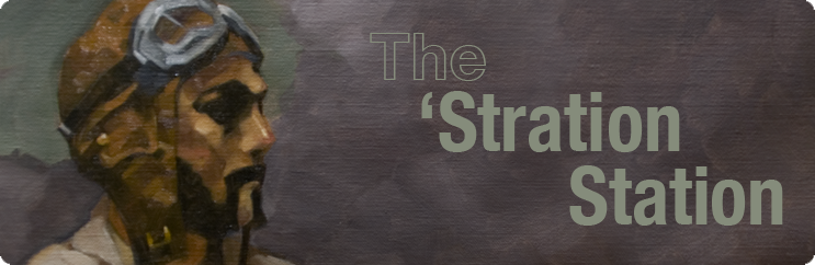
 Painted over my underpainting from the other night. One thing I can say for certain is the painting went a lot faster with the aid of an underpainting. However I feel it's almost overworked. I over-painted. (Rim shot.) There was a freshness in the underpainting that I think has disappeared in the final. Next time I'll slow down some and start with thinner glazes to preserve my preliminary work.


